Over the weekend, I was excited to install a plugin on our site that will make it smart-phone friendly! More and more of our web traffic is coming from iPhones, Blackberries, etc., so it’s important to have a site that is formatted for easy reading on those smaller screens. It doesn’t look quite as cool as the full-blown site but functionality is priority, and not only does is the site easier to read and use on smart phones now, it loads much faster on those devices.
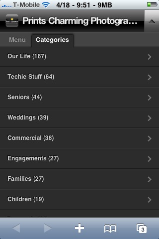
Here’s a screen-shot of the home-page when viewed by an iPhone… First in regular mode, then in mobile mode.
.jpg)
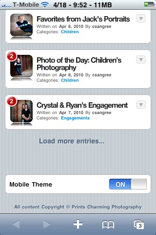
One of the first things that jumps out at you, are the little numbered red circles. Those indicate the number of comments on each post, so you can tell which posts might be more popular, or controversial, etc.
The little triangle on the far right, near the top (just under the green battery symbol) controls the drop-down menu, and gives readers access to the “Menu” (home, email, RSS feed) and to “Categories” (view all posts in a specific category)
Not crazy about the mobile theme? There’s usually an option to turn it off, and this theme by WPTouch is no different. At the bottom of the next picture, you can see the switch that will go from mobile theme to the full site.
The coolest thing about it, is that it detects if you’re on a compatible smart-phone, and displays the mobile theme automatically… There’s nothing you need to do!
If you take a minute to check it out, let us know how you like it! Of course, commenting is easy on the mobile theme, too… Here’s a screen-shot of the comment area.

And that’s about it! If anything doesn’t make sense, please let us know and we’ll explain it further. Happy Monday!


